Our New Website (or, “How It Took Us Two Years to Launch”)
May 7, 2012 - Culture
The Short Version:
We finally launched our new website!
The Long Version:
The Beginning: www1
Where to even begin… Our old site was old. And not very good. Sure, some people liked it, but they were wrong 🙂 Not only did it not communicate all the power and flexibility of FoxyCart, it also looked long in the tooth.
Our first www version (www1) launched when we did, in 2007. It was… a website. Not a good one, but Google loved it, so at least there was that. Notice the awesome stock vector from iStockPhoto in the bottom corner. That’s classy, San Diego.
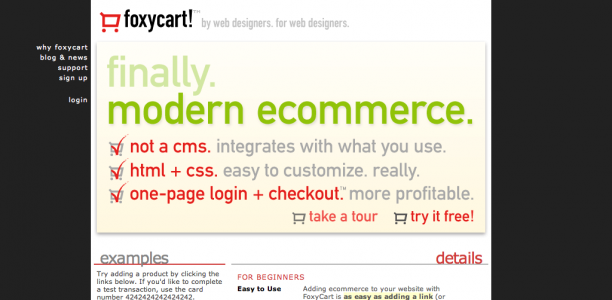
The Last Site: www2
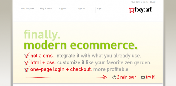
That was never intended to be more than a temp site, so we were stoked to launch our second www version (www2) way back in… well, a long time ago. Maybe 2009. … HOLY WOW! August 2007. (Thank you, Wayback Machine, for making me feel even worse about that than I already did.) … Wow, that’s horrible. We had a site pretty much unchanged for almost five years… I’m going to die a little inside. Here it is:
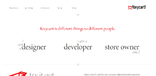
That design was ok, but by 2008 we had a new design, but no time to make it happen. Which is unfortunate, because I actually liked this one:
Rebirth! www3
As the years went on, we continued to grow and serve our wonderful users, neglecting our little www2. By 2010 we knew it was time for a change, so with that in mind we contracted with Cabedge, long-time FoxyCart users and amazing designers. We let them know ahead of time that this website was for our baby (FoxyCart), and it had to be amazing. They were up to the challenge, and after some serious time spent on discussions and wireframes we were finally presented with 4 design mockups. None of which we liked. (We did tell them ahead of time that we were going to be picky, and Bethany handled it super gracefully. 🙂
Luckily, their 5th attempt we fell for. Here’s the final, which we received in… wait for it… August, 2010.
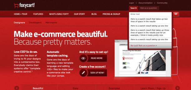
Awesome design, check! Ready to go, August 2010! Unfortunately, we still were stupidly busy with serving you, our users whom we adore. So 2010 passed. Then 2011 started to pass, and we realized something had to change. (Perhaps it was less “realized something had to change” and more “I might personally DDoS our own website if we don’t get the new one launched!”) Luckily by that point our team had grown to include Josh Bartolomucci, whose sole responsibility it was to take Cabedge’s design and build out the rest of the site.
So Josh and I started bringing the new site to life. Mostly Josh, to be honest, with me trying to impart (via jabber) everything we’ve learned over the past 5 years of serving our users. And me telling Josh that whatever he’d just designed (Cabedge only did the homepage; Josh had to figure out the rest) wasn’t quite good enough. That too. Valuable contributions, mine were 🙂
Because Josh was already familiar with it, and because it’s actually a really nice hosted CMS, we went with HiFi to host the site. (One less system for our systems team to manage, which was a plus as well.) We decided to go as far as we could with HTML5, because that’s what the cool kids are doing lately, and as the months progressed we were finally making progress!
The Risk: Watercolors?
As we progressed, we had to fill in the site with imagery. Because FoxyCart isn’t really about what we look like, but rather what you make it look like, we didn’t think we could do the standard spruced-up screenshots like most people do. Also, a lot of FoxyCart is about things you can’t see, like the API, SSO, JSONP, webhooks, etc.
Cabedge had tried a sort of schematic approach on one of their wireframes, which we really liked. (Like our one-page PDF, actually.) So our goal was to get schematics for as much as we could visualize. I still like that idea, but to get a full site’s worth of matching schematics would mean us doing it ourselves, and they’re not fast going, and we really wanted to get this site done. So we had an idea:
Watercolors.
We kept this secret from the rest of the team, because some (<cough>Luke</cough>) have difficulty imagining design. We also thought it was a risk, because the juxtaposition of loose, flowing, organic watercolors seems to clash with presenting FoxyCart as a clean, modern, technically powerful ecommerce platform. We tested a few different artists and finally landed on Catarina Garcia (on Facebook and Blogspot) out of Portugal. And she. Was. Fantastic.
These drawings were based in a drawing series I have done before as a personal project. I was trying to develop a way to draw that resembled movement, so I did some experiences with india ink and I really liked the ones I did with the wood part tip of the brush. It seemed like a technique where I could be more free because I couldn’t pay too much attention to details and to the resemblance, I could give more of me.
So after that I started to add the use of watercolor which I thought was a good combination.
–Catarina
(She also blogged about it.)
It was once Catarina started to add color to the sketches that Josh and I got really excited. No mismatched stock photography. Just something that we hoped would express the care with which we approach FoxyCart. Something custom, like FoxyCart. Something elegant, powerful, awesome. Something magical, pooping rainbows and lucky charms.
Our biggest fear was that Josh and I were groupthinking, and the watercolors would go over horribly. Luckily, people seem to like them, which is thrilling. Because we really, really like them as well. 60+ in all, though some of them didn’t end up getting used.
The Content
In addition to doing individual pages for each feature, we also tried to keep the site very flat, and to always have related information available. For example, each feature page has links to related documentation, features, featured sites, and case studies. For example, the coupons feature page has all four.
We also tried to clearly communicate to our different types of users (developers, designers, merchants) why FoxyCart meets their own needs, and what FoxyCart is not. Our previous site didn’t attempt any of that.
The Proof is in the Pudding Analytics
We’ll hopefully blog more about some of what we’ve done with Google Analytics in the future, but the most immediate and noticeable change we saw was that our pageview per visit fully doubled from www2 to www3. That’s pretty neat.
We’re also getting significantly increased contact form submissions, and many more phone calls (though we can’t easily quantify the changes because we weren’t adequately tracking those on www2).
The Future! www4
www4 doesn’t exist yet, and it may not for a while. Hopefully sooner than 5 years though. But we’re just getting started. Our plans include:
A/B testing, starting on the homepage;
A “Getting Started with FoxyCart” tour (in progress);
Developer/designer/merchant/SaaS specific tours;
Rebuilding the blog a bit;
Reskinning the forum and documentation to match the new feel;
Continuing to change the site to better communicate FoxyCart to new and existing users; and
Adding a neat new FAQ system, which has a neat name and we’ll be open sourcing.
If you’ve made it this far in this small novel, we appreciate your time. What do you think? We’re still big on feedback, so if we can improve this new site for you please let us know.