FoxyComplete: New awesome on our checkout’s country/state autocompleter
September 20, 2012 - Product Updates
A key aspect of any online store is delivering the most straightforward way for your customers to go from selecting a product to paying for the order. FoxyCart has always put a focus on making sure this flow is as streamlined and easy as possible, from the modal cart and single page checkouts, to the ability for customers to easily checkout as a guest and for returning users to quickly validate their login. One aspect of the checkout we’ve wanted to improve, however, was our autocompleter (used for the country and state/province fields). FoxyComplete is the end result of that.
Before I detail what’s new, it’s worth noting at this point that our new autocomplete makes use of two great javascript libraries we found after a significant amount of research: selectToAutocomplete from Baymard Research, and AwesomeComplete by Clint Tseng (which we quite heavily modified to fit our specific requirements). It’s great to have developers who are willing to share their scripts like this, so a huge thanks to them both.
Let’s get onto the good stuff: the features!
There’s more than one way to spell “Spain”
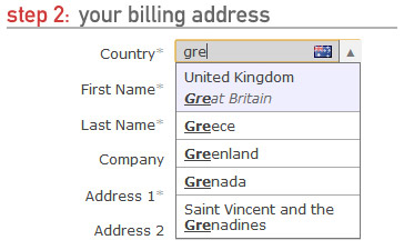
This was a common request for our setup (although not just for Spain). People wanted to be able to find countries by the names they knew, not just the English representation of it. And we agreed, which is why every location in the autocomplete now has the ability to have any number of alternate spellings. We also include the locations 2 character code as another alternate spelling for additional awesome.

For example, this means that a customer looking for the “United Kingdom” could start typing “UK”, “GB”, “Great Britain”, “England” or “Britain” and it would all match to that one single location. Similarly, we can match against different languages as well, for example Spain can be matched against España, Russia to Россия, and Japan to 日本. There are currently over 1,200 different spellings for locations across the different countries and states on FoxyCart checkouts now (compared to just under 440 previously) and this will only increase as time goes on and you guys start letting us know what we’ve missed.
While A comes before B, it’s not always more relevant
Traditionally, an autocomplete field will return locations that the search term matches to and then order them alphabetically. That’s alright if you live somewhere like the Åland Islands, but probably not otherwise. (I’m from Australia so it doesn’t really bother me, but Brett says that US folks often start typing “united” and get United Arab Emirates instead of United States, even for US-based sites.) The selectToAutocomplete library includes some great relevancy sorting functionality which we were able to expand on to provide a really slick and powerful sorting for results that take a lot of factors into account. For example, assigning importance based on whether the search term matches at the start of a location name, at the start of word within the name, or somewhere else, or if it’s matching the main location name or an alternate spelling of it.
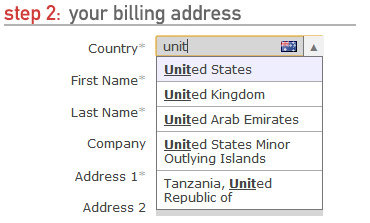
The selectToAutocomplete library also includes a really cool relevancy booster variable for each location, allowing some locations to be promoted higher in the results than others. To make these as accurate and useful as possible, we gathered the total sales data by country across every store on FoxyCart and used these to group countries into tiers based on number of sales. This makes the most commonly used countries across FoxyCart even easier to select, especially where common and uncommon locations were side-by-side. (As a note for the future, eventually we plan to modify the relevancy boosting based on individual stores’ sales rather than system-wide.)
All of these things contribute to a really smart ranking system that will help your customers get to the location they want with as few keystrokes as possible.
(And just in case you didn’t already know, we use geo IP location services to automatically populate the customer’s country when the checkout is loaded. So these improvements are for the <1% of cases where it’s incorrect or not what the customer desires.)
Canton? County? Province? You mean State, right?
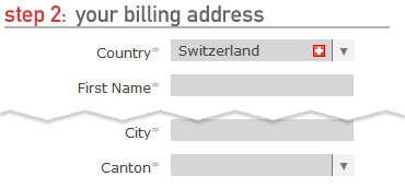
So as it turns out, there’s a few different names used to describe the territorial division of land within a country depending on where you’re from. FoxyComplete takes that into consideration and will dynamically update the label depending on the country choice, with support out the box for ‘State’, ‘County’, ‘Canton’ and ‘Province’. You can even customize them yourself in the language section of your stores foxycart administration.
But we don’t have States, or Provinces, or even Cantons!
Traditionally the “state” address field has always been required, which is not a problem for most, but for others it’s a serious blocker that can result in abandoned checkouts and lost sales. FoxyComplete now updates the state field’s required status dynamically as the country field changes. So, if you don’t have states in your country, or you do but they’re not normally required for shipping purposes, you’re not forced to enter ‘n/a’ anymore to get around validation errors. Your customers can simply leave the field blank and continue on their merry way.
Why does the autocomplete break my tabbing feng shui?
We heard this one a lot, and it sucked. Unfortunately, our old autocomplete didn’t handle tabbing very well in most browsers, either throwing you back to the start of the form, to the browser’s address input field, or requiring two tabs to get to the next field. None of these were acceptable in our opinion. Our new autocomplete respects tabbing as well as general keyboard navigation as well – keyboard junkies rejoice!
But I prefer select drop down boxes…
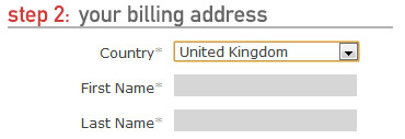
At the heart of FoxyComplete is a simple drop down select input, and if you prefer to keep things simple you can disable FoxyComplete with a simple javascript configuration value and leave the location fields as a vanilla select input. It still has some smarts though – if the selected country doesn’t have any states available, a simple text input will be displayed in its place, with the same dynamically changed state label and required status as FoxyComplete.
But wait, there’s more! (Steak knives not included)
ComboBox: Best friend of the mouse
Not everyone navigates their way around their digital world with keyboard shortcuts, and depending on your store’s target market you may really need solid mouse support on your autocomplete. For the point-and-clickers amongst us we’ve added in an optional comboBox feature which adds a small button to the right hand side of the location dropdown. Clicking this button will open up the dropdown with all results shown (highlighting the currently selected country), allowing you to easily navigate to the country you want with a simple spin of the scroll wheel or drag of the scrollbar.
Country flags! Because pictures say a thousand words
 We’re big fans of pretty icons, and country flags in a 16px by 16px size are super awesome. To make it easy to see which country is currently selected we’ve added in an optional icon of the country’s flag on the right hand side of the input as well, which will update dynamically as the country is changed. (This can be disabled if needed.)
Automatic read-only transition for single location fields
It’s quite common for a store to only take orders from a single country, so the country field could simply be set to that field and marked as read-only. This was always possible with a little bit of javascript on your checkout, but we’ve included it as feature of FoxyComplete. You’ll still need to use some javascript to alter the locations available – but if there is only one country or state available for a given field, it’ll become read-only with the comboBox dropdown hidden and the single location selected – all by default.

Also as a side note, we’ve written up some helper methods that will make restricting the locations objects even easier with 1.0 – you can check them out here.
Design flexibility? Yes.

A huge consideration when building out FoxyComplete is that it had to respond to whatever customisations you make to your templates. The autocomplete can be styled just like any other element in the checkout, and the comboBox and the flag both respond directly to your custom styles. For example, the comboBox is given a width and height that matches the height of the input, including any vertical padding and borders that you’ve applied in your custom styling. This means the design and positioning of the comboBox and the flag is also entirely based off of your design choices – so no matter how you move them around, the comboBox and the flag sit where they are meant to.
As with all things, there are caveats – so if you’re doing something really custom like displaying background images inside the inputs which means the computed height of an input doesn’t match the visual height – you’d simply overwrite the height of the elements to match what your design requires, simple as that!
A technical side note for those interested: We found a weird bug in IE9 that was causing a 1px height difference between the input and the comboBox. Essentially it appears that due to IE9’s font soothing the height was changing from 14px to 14.58px. Because of that part of a pixel while the browser still rendered it as 14px visually, the javascript was returning 15px. As a workaround we have set the height of the input in IE9 only to match what the javascript returns, keeping everything nice and consistent.
The future
There are already a couple things we’re looking at for future improvements to FoxyComplete. Specifically we’re looking at making the location data localised for your store by creating the booster value from your stores sales as well as general sales statistics. We’d also like to create some alternate location name localizations to allow for the primary names for locations to be relevant for your store – not just the English spellings you currently get.
Ultimately our focus with this new iteration of the location autocomplete is to make your FoxyCart powered checkouts even quicker and easier for your customers to use. As always though, we’re open to your comments and suggestions about how we could make it even more awesome, or if you have some location details we’ve missed, we’d love to know them too!
Getting started…
FoxyComplete joins a list of some other great new functionality that is included in FoxyCart 1.0 – including powerful Twig templating, ZIP based tax lookups and new pricing (see this earlier post for more information). If you want to give all of these great new features a try, simply set up a store on version 1.0 (as always, it’s free for a development store) and have a play!